Apple has quietly made some changes to iOS 6's App Store app formatting tonight and introduced a new search results format that seem clearly inspired by Chomp.
Chomp was a three-year old search and app discovery startup that was acquired by Apple earlier this year. The reason for the acquisition was reportedly to improve the App Store search and app discovery. It appears the first of those efforts are being deployed in iOS 6.
iOS 6 search results on left, Chomp app shown on right
On the iPhone, the new search results show a single tile result that can be swiped to move to each new result. Chomp's iOS app used a similar tile system in their search results.
In a thread in our forums, some users are already unhappy with the shift as it is slower to browse through many results.
Meanwhile, 9to5Mac notes several other changes in App Store functionality such as Genius support, Purchased section and Podcast search:
Also adding to the iOS 6 App Store updates, Apple has enabled the Genius recommendation section this evening, providing users with apps that may be in their interest to download. Furthermore, the purchased section has also joined the party, displaying all the apps a user has downloaded to their account, making it easy to retrieve favorite apps. Last but certainly not least, the iTunes Store has been updated with the ability to once again search for podcasts.
The iPad version of iOS 6 also shows the new tile-based results, but is able to show four results at a time. (screenshot).
Apple's Worldwide Developers Conference (WWDC) starts today with the traditional keynote kicking things off at 10:00 a.m. Pacific Time. MacRumors is on hand for the event and we'll be sharing details and our thoughts throughout the day.
We're expecting to see a number of software-related announcements led by a design revamp across Apple's platforms that will also see the numbering of all of...
At today's WWDC 2025 keynote event, Apple unveiled a new design that will inform the next decade of iOS, iPadOS, and macOS development, so needless to say, it was a busy day. Apple also unveiled a ton of new features for the iPhone, an overhauled Spotlight interface for the Mac, and a ton of updates that make the iPad more like a Mac than ever before.
Subscribe to the MacRumors YouTube channel ...
Apple today announced a complete redesign of all of its major software platforms called "Liquid Glass."
Announced simultaneously for iOS, iPadOS, macOS, watchOS, tvOS, visionOS, and CarPlay, Liquid Glass forms a new universal design language for the first time. At its WWDC 2025 keynote address, Apple's software chief Craig Federighi said "Apple Silicon has become dramatically more powerful...
Apple today announced that iPadOS 26 will be compatible with the iPad models listed below.
iPadOS 26 features a new Liquid Glass design, a menu bar, improved app windowing, and more.
iPadOS 26 supports the following iPad models:iPad Pro (M4)
iPad Pro 12.9-inch (3rd generation and later)
iPad Pro 11-inch (1st generation and later)
iPad Air (M2 and later)
iPad Air (3rd generation and...
In 2020, Apple added a digital car key feature to its Wallet app, allowing users to lock, unlock, and start a compatible vehicle with an iPhone or Apple Watch. The feature is currently offered by select automakers, including Audi, BMW, Hyundai, Kia, Genesis, Mercedes-Benz, Volvo, and a handful of others, and it is set to expand further.
During its WWDC 2025 keynote today, Apple said that 13...
Apple at WWDC announced iOS 26, introducing a comprehensive visual redesign built around its new "Liquid Glass" concept, alongside expanded Apple Intelligence capabilities, updates to core communication apps, and more.
Liquid Glass is a translucent material that reflects and refracts surroundings to create dynamic, responsive interface elements, according to Apple. The new design language...
Somehow I don't think this is done. There needs to be a way to toggle between this view and the normal list view, otherwise it would take forever to look at your search results. :confused:
It's like they made the Music app with only the coverflow interface.
When I want to "search" for something I don't want to have to scroll through each. and. every. one. of. them. at. a. time. *sigh* What was the point of this? How does it improve the user experience at all?
I prefer the Top 25 in the middle rather than Genius. This tiled theme will also be slower to look through the apps. Plus they take away streetview & youtube. Tempted to stay with ios 5.
It now means that someone searching for your app that doesn't quite remember the name will likely not find it.
I think it is fine that they show more info on the results page, but only a single result at a time? It is like using Google just with the "I'm Feeling Lucky" button.
 iOS 6 search results on left, Chomp app shown on right
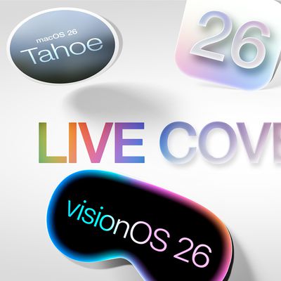


